Elevate Your Donut Charts: A Sweet Recipe for Visual Success
Ready to cook up a storm in Power BI? Imagine serving up a delightful mix of KPIs with a donut chart that’s not just one chart but a scrumptious blend of six! Follow this recipe to create a multi-layered, visually appealing dashboard that will have your audience craving more insights.
Ingredients:
- A dataset with demographic data (e.g., workforce data)
- Measures for:
- Percentage of females
- Percentage of minor ethnicity
- Percentage of baby boomers (born between 1946 to 1964)
- An icon image for the Demographic title
- Canvas size: Height: 1080px, Width: 1920px
Method:
- Prepare your measures:
- Create a measure for the percentage of non-females using the [% Female] measure.
% Non Female = 1 - [% Female]
- Create a measure for the percentage of non-minorities using the [% Minority] measure.
% Non Minority = 1 - [% Minority] - Create a measure for the percentage of non-boomers using the [% Boomers] measure.
% Non Boomers = 1 - [% Boomers]
- Create a measure for the percentage of non-females using the [% Female] measure.
- Create the title:
- Add a Blank Button visual to the canvas to craft your chart’s title.
- Size > Height: 50px, Width: 300px
- Under Style > Icon, select “Custom” and upload your icon image.
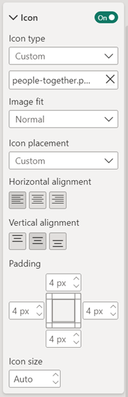
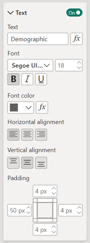
- Set the title text to “Demographic”, choose your preferred font and size, set Left Padding to 50px, and align the text to the Left.
- Add a Blank Button visual to the canvas to craft your chart’s title.
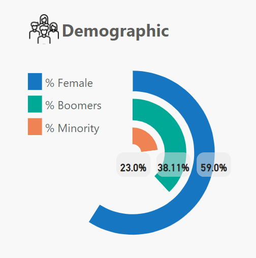
- Create your first Donut Chart:
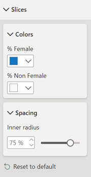
- Add [% Female] and [% Non Female] to the Values.
- Turn off the Legend, Detail labels, Title, and Background.
- Size: Height: 301px, Width: 301px
- Match the slice color for [% Non Female] to the background color.
- Adjust Inner Radius to 75% under Slicers > Spacing.
-
- Add the second Donut Chart:
- Add [% Boomers] and [% Non Boomers] to the Values.
- Turn off the Legend, Detail labels, Title, and Background.
- Size: Height: 201px, Width: 201px
- Position it 50px lower and right from the [% Female] donut chart.
- Set slice colors: [% Boomers] to the second theme color and [% Non Boomers] to the background color.
- Keep Inner Radius at 60%.
- Prepare the third Donut Chart:
- Add [% Minority] and [% Non Minority] to the Values.
- Turn off the Legend, Detail labels, Title, and Background.
- Size: Height: 101px, Width: 101px
- Position it 50px lower and right from the [% Boomers] donut chart.
- Set slice colors: [% Minority] to the third theme color and [% Non Minority] to the background color.
- Adjust Inner Radius to 35% under Slicers > Spacing.
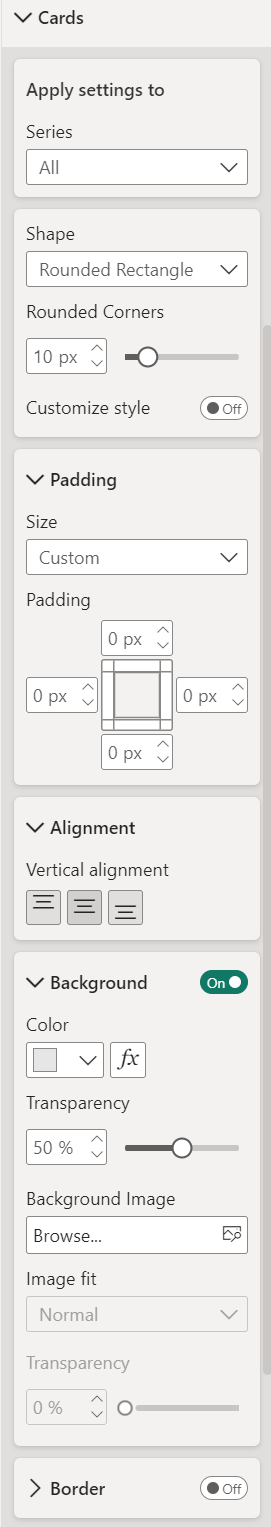
- Create the Details label by using the Card (new) visual:
- Values: [% Minority], [% Boomers], [% Female] (in that order).
- Under Callout values > Values, set Font Size to 12, make it Bold, and Center the alignment.
- Under Cards > Shape, select Rounded Rectangle with 10px Rounded Corners.
- Set Padding to Custom with 0px on all sides.
- Background color: Light grey with 50% transparency.
- Turn off the Border and Background under Effects.
- Size: Adjust to fit text, around 45px in height.
- Craft the Legend with another Card (new) visual:
- Values: [% Female], [% Boomers], [% Minority] (in that order).
- Under Layout, choose Single Column arrangement.
- Under Cards, turn off Background and Border.
- Adjust Padding: Left 25px, Top 2px, Bottom 2px, Right 0px.
- Enable Accent bar with Width set to 20px.
- Apply settings to Series, selecting each series color to match the theme colors.
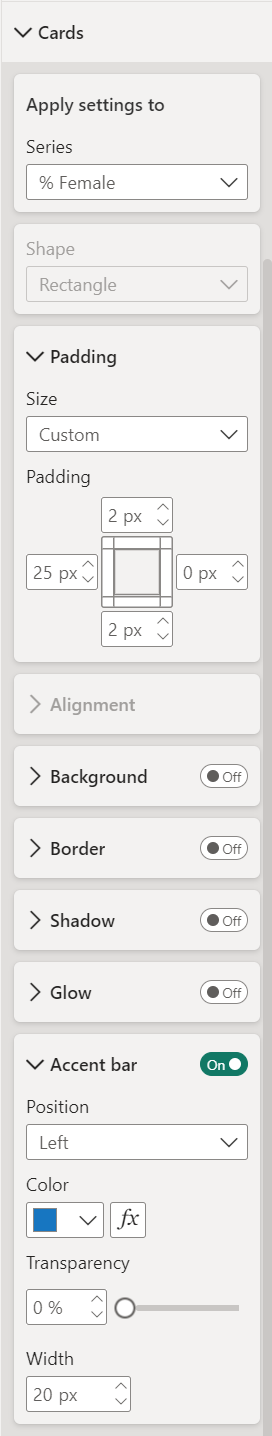
- Size: Height: 100px, Width: 125px.
- Turn off Background under Effects and position your legend neatly.
Voilà! You’ve just crafted a multi-layered donut chart visual that serves up a delightful combination of KPIs. Your audience will love the clear, engaging representation of your demographic data. Enjoy your sweet success!